Power BI provides a wide variety of options to connect, analyze and visualize data from various sources. There were many instances where I’ve been asked to get a count of all users in the domain while in meetings and if possible a country-wise breakdown. Well..I don’t have that ready but would be nice to know if this information was needed earlier. As the user count is a moving target, I figured it’d be nice to have a PBI viz to help me answer this whenever asked.
There are several different ways to get this information and PBI viz is one of those.
In this post, I’ll go over steps on creating a visualization that I find useful to get a breakdown of users in the domain by country.
This should give you an idea on how to connect Power BI to AD and pull data to built visualizations.
To proceed further, make sure you have the Power BI desktop App downloaded and installed on your machine.
Launch Power BI Desktop,
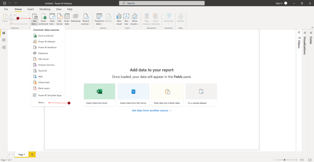
- Click Get data and Click More…
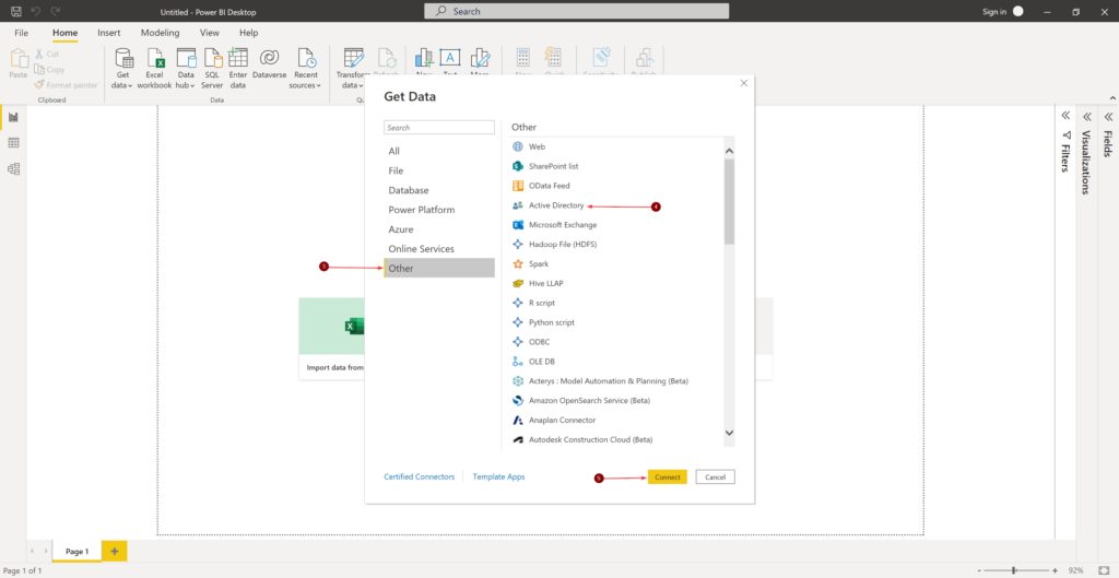
- In the Get Data window, Click Other and Active Directory
- Click Connect
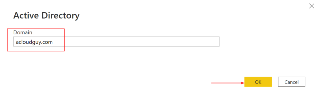
- Enter your Domain name under Domain then click OK
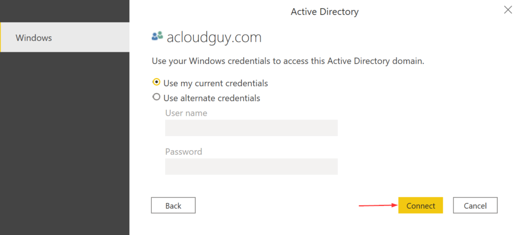
- Enter credentials which has permissions to read attributes from AD and click Connect
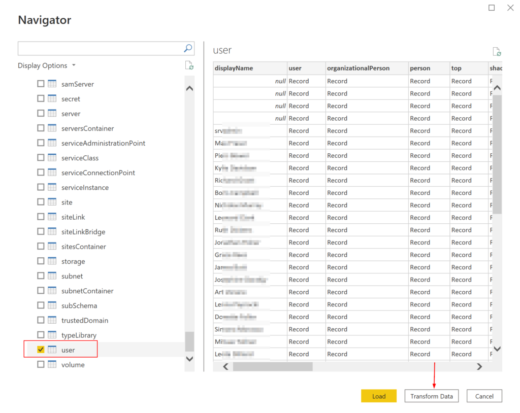
- The Navigator window shows all the tables available. In this post, I’m only going to use the data from user table
- Place a check mark next to user and click Transform Data
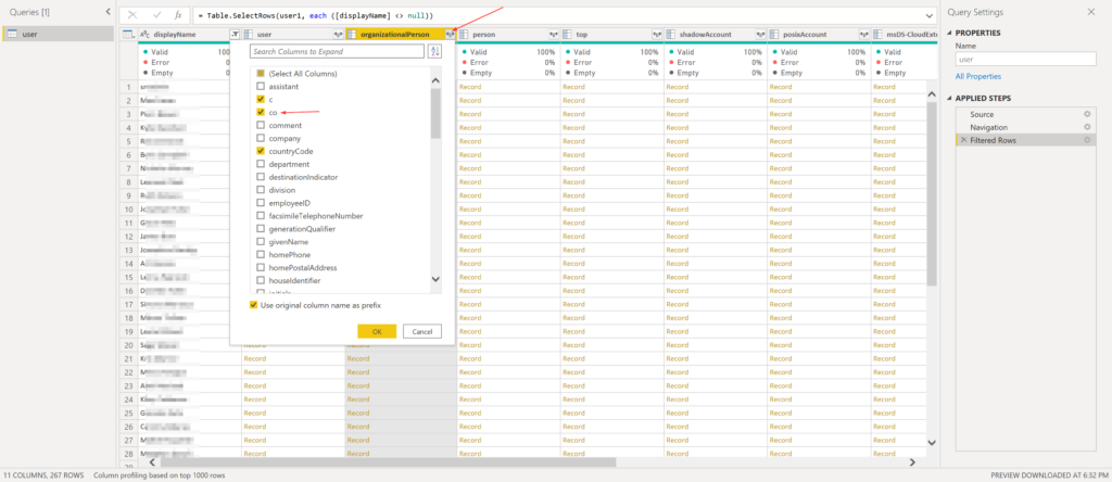
- In the Power Query Editor window, we can select the values we’ll be working with. As we can see, the query editor has detected what is known as Complex columns. The reason they are complex is that they actually contain an object, not just a simple value like a single line of text column.
- Click on Expand column icon
- Place a checkmark next to co
- I’m also selecting c and countryCode for the sake of it, because why not! 😉
- I’m also leaving the Use original column name as prefix checked
- Click OK
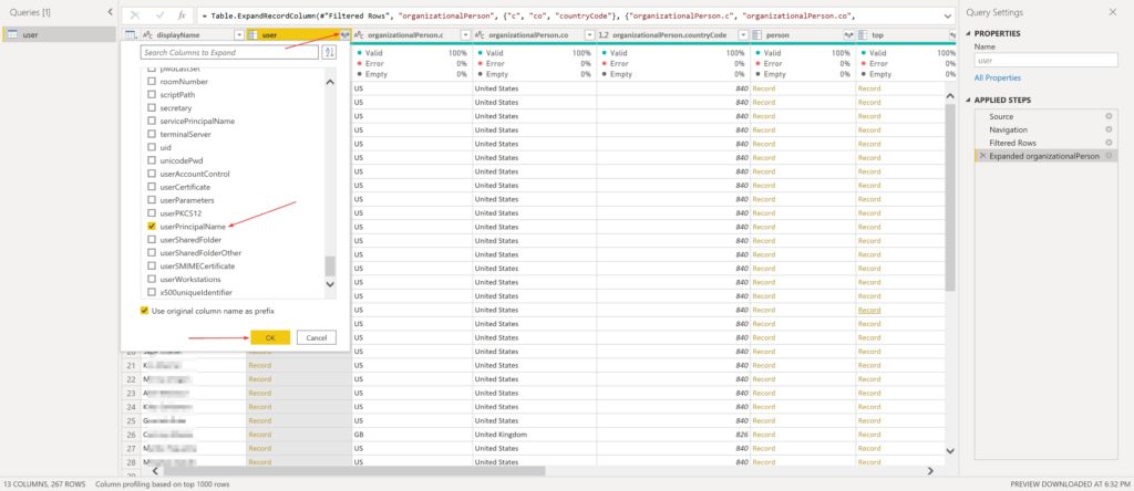
- I’m repeating the same steps for other columns as well to pick values I need
- I’d need the UPN for unique values, so I’m picking that
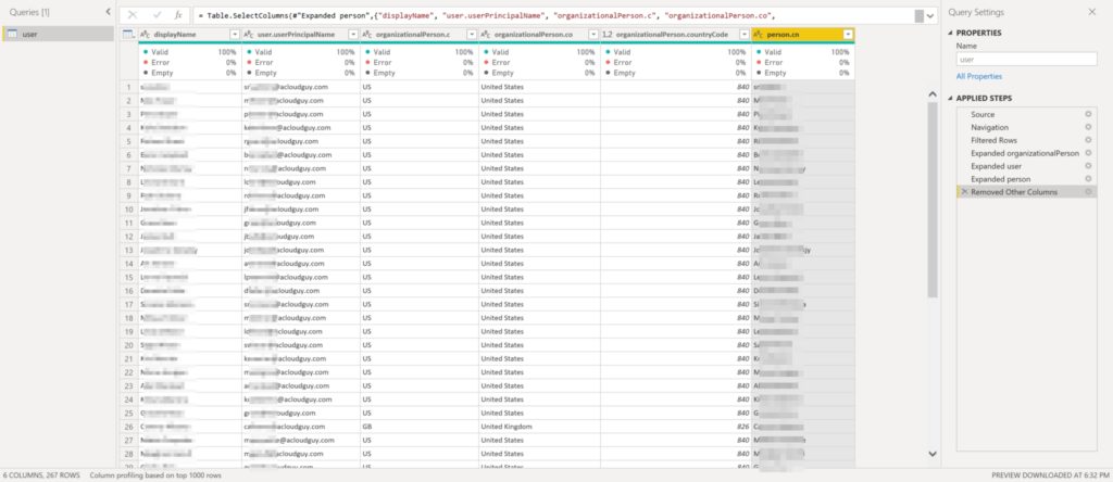
- Below screenshots shows all the columns I’ve selected to be loaded using Choose Columns, unselecting the columns I don’t need
- Once satisfied with the data, Click Close & Apply
- Data gets loaded into the model and depending on how many users you have in your domain and the hardware specs of the machine running PBI desktop, this can take a while
Below I have created a basic visualization which shows a pie chart with user breakdown by country name,
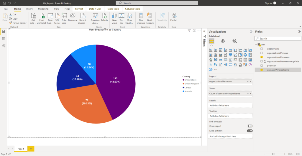
I did some formatting of the title, the legend and such to make it look pretty. If the data changes in AD, you can click on Refresh to get the updated information populated in the visualizations you create.
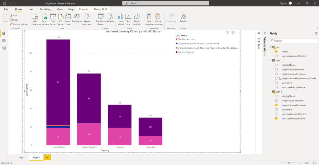
Here is another basic stacked column chart I created with UAC status of users per country. I created a UAC table which has the values for the UAC codes in AD and I merged those queries. I keep saying these are basic because by no means I’m a PBI expert but I’m very interested in learning and improving my skills in it every chance I get.
You can incorporate the visualizations you create, in a AD dashboard in PBI and If you have an on-premise PBI report server you can publish this report there or to PBI web.
Hope this post helped you in your AD visualizations journey.
Thank you for stopping by✌