October didn’t disappoint for Power BI fans. This month’s update is a powerhouse of innovation, from AI-driven Copilot for DAX and sleek Button Slicer upgrades, to long-awaited features like Export Query Results, ARM support, and a new Power BI Controller for PowerPoint that finally makes managing embedded visuals painless.
Whether you’re an analyst fine-tuning dashboards or an enterprise architect optimizing your Fabric workflows, there’s something here that will make your data life easier (and maybe even fun). Let’s dive in.
Table of Contents
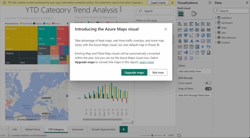
General: Goodbye Bing Maps, Hello Azure Maps
Microsoft is moving full steam ahead with the transition from Bing Maps to Azure Maps in Power BI. This change future-proofs map visuals with richer capabilities and better integration across Microsoft’s ecosystem.
- Power BI Desktop & Service: The Bing Maps icon will stick around for now, but it’s still on the deprecation path. Start upgrading to Azure Maps if your reports aren’t used in China, Korea, or government clouds.
- Paginated Reports: Phase 1 migration to Azure Maps is complete in Power BI Report Builder (PBIRB). Phase 2: service-side migration, wraps by mid-November 2025.
Paginated report authors who still rely on Bing Maps can temporarily switch back while the Azure Maps migration completes. To do so, set the RevertToBingMaps registry key to 1 under:
Computer\HKEY_LOCAL_MACHINE\SOFTWARE\Microsoft\Microsoft Power BI Report Builder
If the Microsoft Power BI Report Builder folder doesn’t exist, simply create it before adding the key. This option allows continued authoring with Bing Maps until both migration phases are fully rolled out.
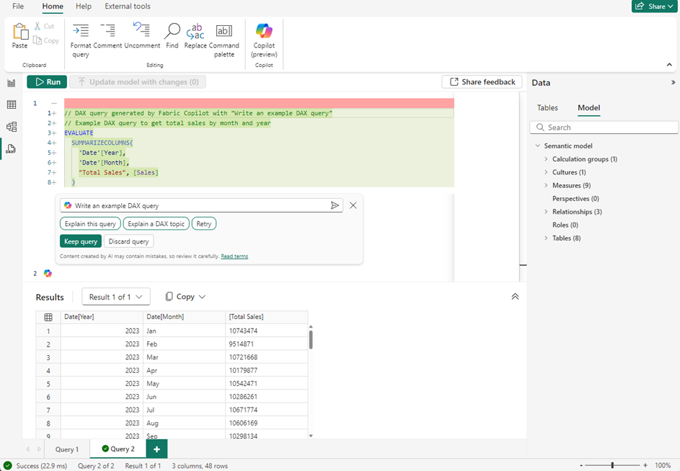
Copilot and AI: Let Copilot Write Your DAX
DAX just got way less intimidating. The new Copilot-powered DAX query view (now Generally Available) lets you describe the insights you need in plain English and Copilot writes the DAX for you. You can edit the query conversationally, test it live, and learn as you go.
Copilot is context-aware, leveraging your semantic model, understanding relationships, measures, and hierarchies. Whether you’re exploring data in the DAX query view, chat with your data, or semantic model–backed data agents, Copilot is ready to help.
To learn more, refer to the Write DAX queries with Copilot documentation, and try it out today!
Reporting: Visual Power and Presentation Control
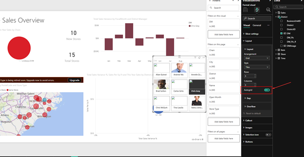
Button Slicer (GA) — More Interaction, Less Effort
The Button Slicer graduates from preview with new cross-highlighting and Auto Grid features.
- Cross-highlighting: Like the Chiclet slicer, it dims unrelated visuals and highlights related ones, helping you instantly spot correlations.
- Auto Grid: Automatically arranges rows and columns to fit your layout. No more pixel-perfect wrestling.
Accessibility improvements make it more inclusive, and it’s now your go-to slicer for modern report interactivity.
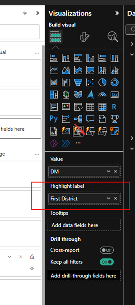
For example, following with Auto grid on:
Visual Calculations in Embedded Reports (Preview)
Embedded analytics gets a boost, visual calculations are now supported in “Embed for your customers” scenarios.
You can define calculations directly in visuals without touching the data model or writing DAX. This means ISVs and developers can deliver faster, dynamic insights in embedded Power BI solutions.
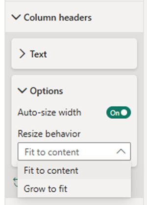
Grow to Fit — Tables that Auto-Resize Gracefully
A small change with a big impact: Power BI tables now support “Grow to Fit”, automatically distributing unused space across columns. It’s the polish your reports deserve — clean, balanced, and professional, no manual resizing required.
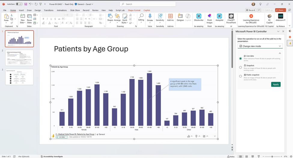
Power BI Controller for PowerPoint (Preview)
Say goodbye to repetitive manual updates in slide decks. The new Power BI Controller add-in for PowerPoint acts as a central control panel to manage all embedded Power BI visuals across multiple slides.
Bulk refresh, update, or replace visuals in one shot. Simply install the add-in from the PowerPoint ribbon, open the command pane, and let the Controller handle the heavy lifting.
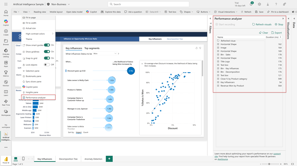
Performance Analyzer in Web
The Performance Analyzer pane — long loved in Desktop, is now available in the web experience. You can finally measure the load times of visuals directly where your users view them.
Rollout hits all tenants within weeks.
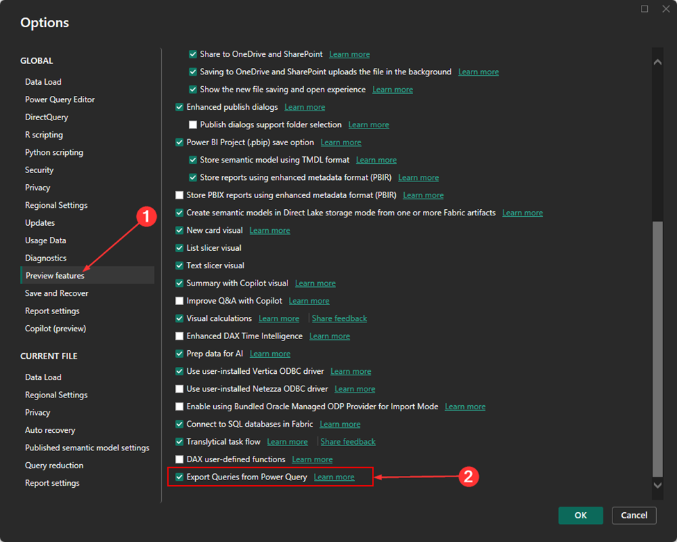
Data Connectivity: Export Query Results (Preview)
This one’s huge for data engineers and Fabric users. Export Query Results lets you take transformed Power Query data and export it directly to Dataflows Gen2, Lakehouses, or OneLake — all from Power BI Desktop.
Why It Matters
- No more copy-paste or third-party hacks.
- Seamless handoff from analyst prep to enterprise storage.
- Streamlined refresh, monitoring, and interoperability across Fabric workloads.
How to Try It
- Go to File → Options → Preview Features → Export Queries from Power Query.
- In Power Query Editor, open Export Query Results.
- Choose a Fabric destination and credentials, then export.
Result: A Fabric Dataflow Gen2 created automatically in your workspace — ready for refresh and governance.
Open the Export query results feature
After enabling the preview:
- Open Power Query Editor from the ribbon (Transform) or the query menu (Edit Query).
- In the ribbon, select Export Query Results.

Check Fabric access
To use this feature:
- You need access to Microsoft Fabric.
- Your My Workspace must be assigned to a Fabric or trial capacity.
- If these conditions aren’t met, you’ll see an error message.
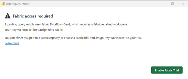
Options:
- Sign up for a Fabric trial and assign your workspace.
- Assign My Workspace to a Fabric capacity in your organization.
- If you can’t enable Fabric, contact your Fabric admin.
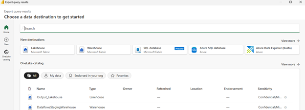
- Select a destination
- Once your workspace is assigned to Fabric, choose an online destination:
- Supported destinations match those in Fabric Dataflows.
- You can also pick existing OneLake destinations.
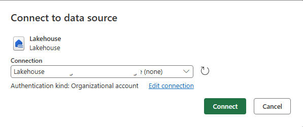
Enter credentials
After selecting a destination:
- Enter your credentials.
- Select Connect, then Choose.
- Confirm and export
You see a summary screen:
- A Fabric Dataflow Gen2 is created in My Workspace.
- You can rename the dataflow but can’t change the workspace yet.
- Expand Manage Connections to check or fix query connections.
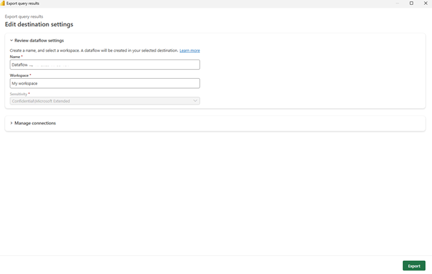
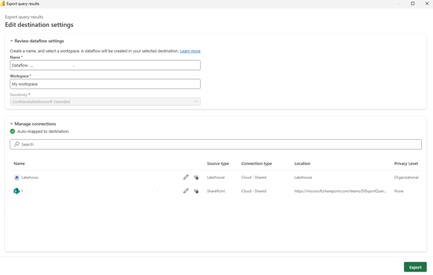
- When ready, select Export.
- The next screen shows export progress.
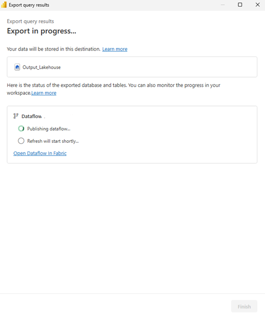
- After completion, review your dataflow in Fabric.
- If errors occur, open the dataflow in Fabric and run it to debug.
Platform Support: Power BI Desktop on ARM
Power BI Desktop now runs natively on ARM-based Windows devices (with KB5065789 installed).
That means better performance, lower battery usage, and optimized experience for lightweight, energy-efficient devices — ideal for users working on the go.
This move aligns with Microsoft’s broader ecosystem shift toward ARM and ensures Power BI stays modern, fast, and portable.
Visualizations: Fresh, Functional, and Fun
The marketplace is buzzing this month — here are the standouts:
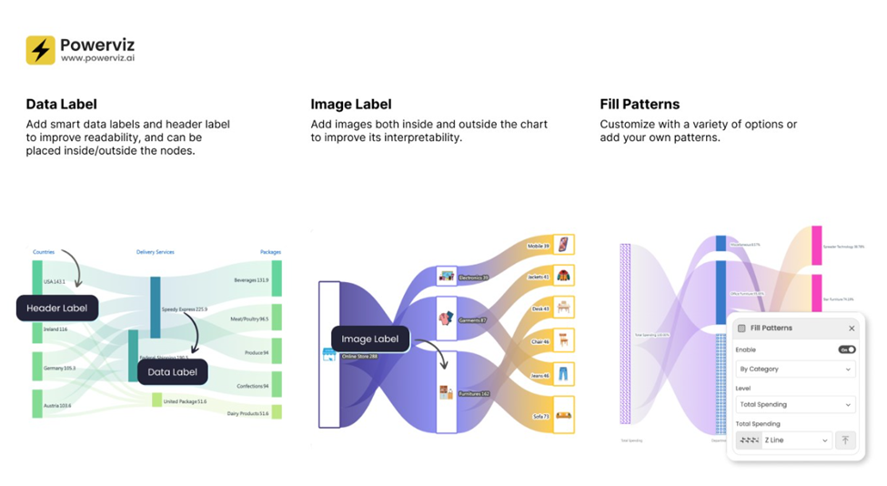
Sankey Chart by Powerviz
Flow your data like never before. The Sankey Chart visual adds vertical/horizontal orientations, multi-level support, color-blind palettes, conditional formatting, and even image labels. Perfect for customer journeys, expense flows, and supply chains.
- Try Sankey Chart visual for FREE from AppSource
- Check out all features of the visual: Demo_file
- Step-by-step instructions: Documentation
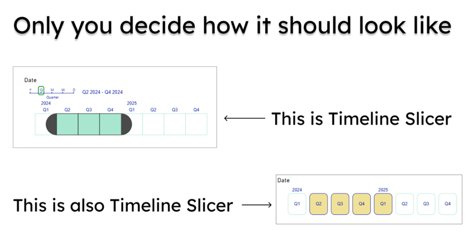
Your Timeline Slicer
Microsoft’s compact, modern timeline visual saves up to 60% dashboard space while introducing Current Period and Latest Available filters. It’s sleek, adaptive, and made for executive dashboards.
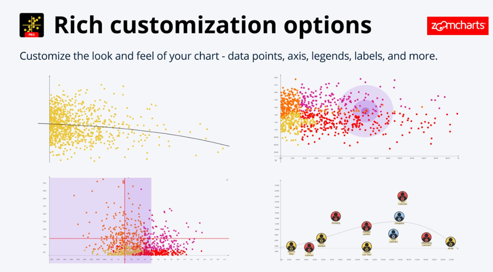
Drill Down Scatter PRO by ZoomCharts
Intuitive data exploration meets smartphone-like UX: zoom, pinch, click to drill down. Great for interactive scatter plots with regression lines, category clusters, and visual storytelling.
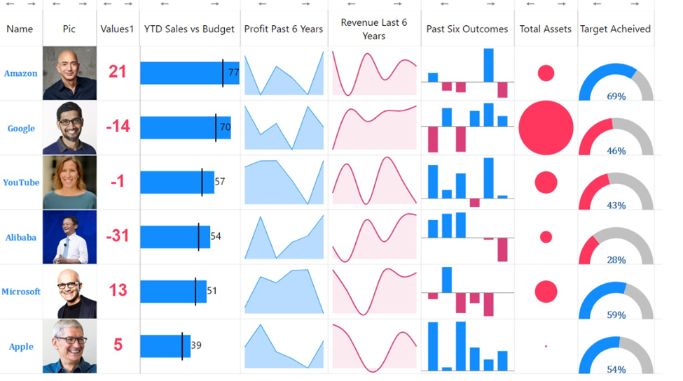
Multiple Sparklines
Build a complete Income Statement in one visual with trend, comparison, and benchmark columns. Clean, compact, and storytelling-ready.
Performance Bar by JTA
Minimalist progress bars with optional total bars, dynamic labels, and animations. Ideal for tracking KPIs in a sleek way.

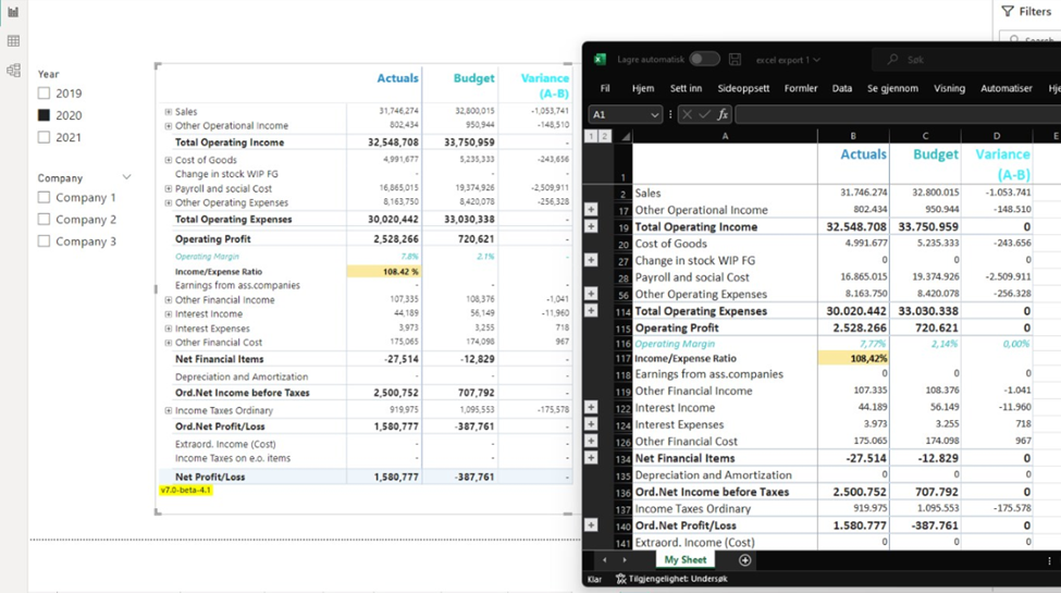
Financial Reporting Matrix v8.2
Adds RowHeaderParent(), Invert Sign Factor, conditional formatting enhancements, pinned columns, and comment support (even exporting comments to Excel!). It’s the accountant’s new best friend.
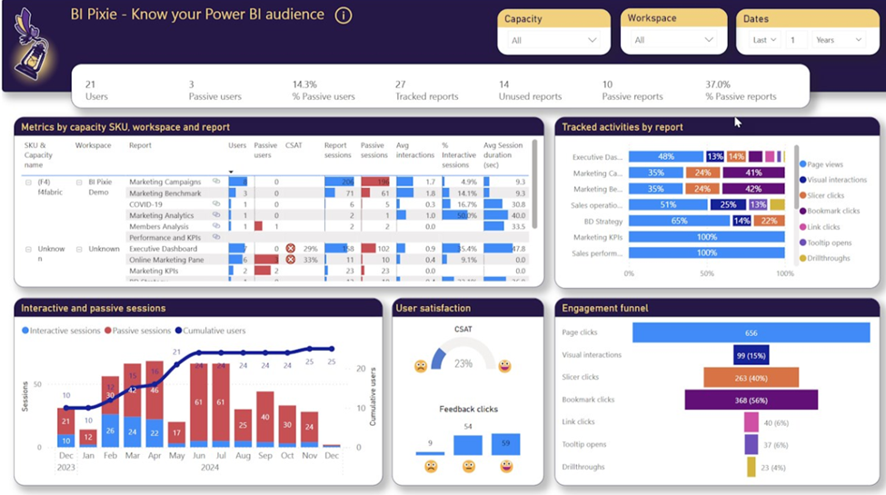
BI Pixie by DataChant
A robust governance and adoption tracker now measuring six dimensions from Adoption to Security. BI Pixie audits Power BI usage and detects RLS misconfigurations, helping orgs boost ROI on analytics.
Closing Thoughts
October 2025 proves that Power BI isn’t slowing down, it’s accelerating into an era of AI-assisted modeling, Fabric-integrated data mobility, and cross-platform performance.
Copilot is rewriting DAX (literally), the Button Slicer is smarter than ever, and Power BI is now comfortably running on ARM because analytics should be as agile as the people using it.
Final Takeaway
If you’re building reports or managing analytics platforms:
- Start transitioning your maps to Azure Maps.
- Enable Copilot for DAX and Export Query Results.
- Experiment with the Power BI Controller for PowerPoint for presentation efficiency.
- Explore the new visuals, they’re not just eye candy; they simplify storytelling.
Thank you for stopping by. ✌️